
How to Format APA 7 Graphs Without Wasting Your Entire Afternoon
Most psychology students can recognise Loftus faster than they can format a half-decent graph. This is not a criticism. It is just one of the small absurdities of academic life. You can spend weeks learning about memory distortion, statistical significance, and research design, then lose an entire evening because Excel insists on turning your simple bar chart into something that looks like it belongs in a doomed corporate presentation.
APA 7 is not against graphs. Quite the opposite. The point of figures is to present information clearly and efficiently. The problem is that software defaults are usually designed for “visual impact,” which is a polite way of saying unnecessary colour gradients, bulky legends, mystery gridlines, and an overall air of chart-based misconduct. APA, by contrast, wants figures to be readable, properly labelled, and understandable on their own. Figures should supplement the text, not act as decorative wallpaper.
The result is that students often end up trapped between two bad options. Either they leave the graph looking like raw spreadsheet exhaust, or they start manually nudging fonts, axes, spacing, and labels for so long that the figure becomes less a research aid and more a low-stakes nervous breakdown.
TL;DR
A good APA 7 graph is not the prettiest graph you can make. It is the clearest one. That usually means choosing the right graph type, stripping out visual clutter, labelling everything properly, and making sure the figure can stand on its own without the reader having to guess what on earth they are looking at. APA treats graphs as figures, and figures should be clearly numbered, titled, and, when needed, explained with a note.
First, do you even need a graph?
This is a more important question than students often realise. Not every result deserves to become a figure. If you are presenting a couple of simple descriptive values, a sentence may do the job better. Graphs are useful when they make patterns easier to see, especially comparisons, trends, or relationships. They are not there to make the page look busy. Purdue OWL puts this quite sensibly: figures should supplement the text, be understandable on their own, and be fully referenced in the text.
That sounds obvious, but it quietly kills off a lot of bad graphs. If your figure adds nothing beyond what one sentence could say, it is probably not earning its place.
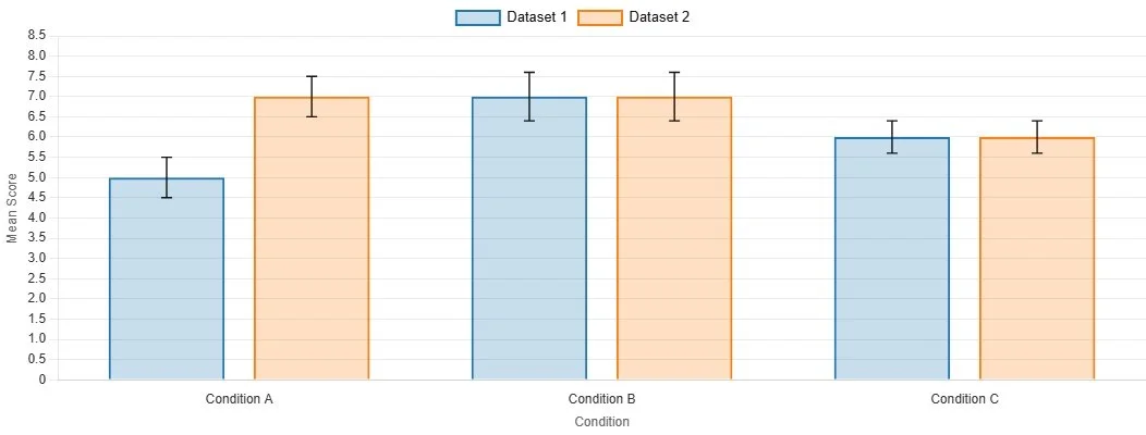
An example of an APA bar chart made using our Graph Maker
The three graph types students usually need
For first-year psychology work, most of the time you are dealing with one of three basic options.
A bar chart is useful when you are comparing categories or groups. Think treatment group versus control group, or mean score by condition.
A line graph is useful when you want to show change over time or across ordered points. Think mood ratings across four time points, or performance across trial blocks.
A scatterplot is useful when you are showing a relationship between two continuous variables, such as stress and sleep quality.
The graph type should match the structure of the data. This is one of those things that sounds too basic to mention, yet students constantly end up showing continuous relationships in bar charts or categorical group differences in shapes that make no visual sense at all. Purdue’s APA guide identifies graphs, charts, plots, maps, drawings, and photos as figures, with scatterplots, line graphs, and bar graphs among the common forms used to convey relationships and comparisons.
What APA actually expects from a figure
This is the bit people tend to overcomplicate.
In APA 7, a figure normally needs a figure number, a title, the image itself, and, where needed, a note beneath it. APA’s own figure guidance describes figure setup in terms of figure components, principles of construction, and placement in a paper. The APA student formatting checklist also notes that legends should sit within the figure borders and that notes can appear beneath the figure when needed. Search-accessible APA guidance on line spacing also indicates that the figure number, title, and notes are double-spaced, while words inside the image itself can be single-spaced, one-and-a-half spaced, or double-spaced depending on readability.
In less ceremonial English, that means this:
You put Figure 1 above the graph.
Below that comes an italicised title in title case.
Then comes the graph itself.
Then, if needed, a note explaining abbreviations, symbols, error bars, or anything else the reader would not automatically know.
This is where a lot of student graphs go wrong. They have the image, vaguely. What they do not have is a proper figure.
Mistake 1: Letting Excel make aesthetic decisions on your behalf
Excel is not your co-author. It is a spreadsheet program with a taste for excess.
Its default graphs tend to include too much of everything: heavy gridlines, unnecessary borders, loud colours, odd spacing, and legends that repeat information already obvious from the axis labels. The result is usually clutter. APA guidance on accessible figure design also emphasises clarity and sensible colour use, rather than decorative overload. University APA guides based on 7th edition conventions likewise stress limiting shades, keeping axis labels clear, and avoiding gratuitous visual noise.
A decent rule is this: if a design feature does not help the reader understand the data faster, it is probably just sitting there looking pleased with itself.
Mistake 2: Choosing the wrong graph for the wrong job
A surprising amount of misery begins here.
If you are comparing group means, a bar chart may work. If you are showing a relationship between two measured variables, use a scatterplot. If the x-axis represents ordered progression, a line graph usually makes more sense. This is not just aesthetics. The graph shape quietly tells the reader what kind of relationship they are supposed to be seeing.
Get this wrong and the figure starts lying before the reader has even reached the results section.
Mistake 3: Writing labels as though the reader is psychic
Axes need labels. Categories need names. Units need to be clear. If the y-axis is “Score,” score on what? If the x-axis says “Condition,” what conditions? If you have abbreviations in the figure, explain them in the note unless they are genuinely standard.
APA-oriented library guidance notes that figure titles should be brief but descriptive, and that notes beneath the figure can clarify symbols, abbreviations, or other details needed to interpret the image properly. Figures are supposed to be understandable on their own. That only happens if the labels do some actual work.
A graph should not require the reader to perform detective work.
Mistake 4: Keeping the legend when the legend is doing absolutely nothing
Students often leave legends in place because software puts them there, which is not a great intellectual standard.
If the bars or lines are already clearly labelled, the legend may be redundant. If you do need one, APA’s student checklist says it should be positioned within the borders of the figure. In other words, even the legend has a job to do. It is not there to lurk off to the side like a decorative plaque.
A good figure is selective. It keeps what clarifies and cuts what repeats.
Mistake 5: Forgetting that the graph has to match the rest of the paper
This is a quieter problem, but it matters. A figure should not look as though it was imported from a completely different universe. Fonts should be readable. Capitalisation should be consistent. Spacing should not suddenly become chaotic. APA guidance indicates that figure numbers, titles, and notes follow the broader paper formatting logic, while words within the image can be spaced according to what makes the figure legible. The point is coherence, not software obedience.
Your graph does not need to be artistically thrilling. It just needs to look like it belongs in the paper.
A practical checklist before you export anything
Before you submit, ask yourself four very plain questions.
Does this graph make the result easier to understand than text alone?
Is the graph type actually appropriate for the data?
Are the axes, categories, and units clearly labelled?
Could a tired marker understand it without guessing?
If the answer to any of those is no, the graph is not finished. It is only present.
Why students get stuck here
Because graph formatting sits in that horrible academic category of tasks that are too technical to improvise and too fiddly to feel intellectually rewarding. You know there is probably a right answer, but software keeps offering you twenty wrong ones in cheerful colours.
That is exactly the sort of friction Original Matteris built around. The issue is not that students are incapable of learning APA graph rules. It is that there is no good reason for them to burn half an evening manually removing chart junk, fixing labels, and trying to remember where the title and note are supposed to go when the real point of the assignment is the research, not the wrestling match with Excel.
Stop Letting Your Graphs Sabotage You
If you have ever spent more time formatting a graph than thinking about what the graph actually shows, you have already met the problem.
The Original Matter APA Formatting Pack is designed for psychology and social science students who want cleaner tables, graphs, and results presentation without wasting hours on software defaults and formatting trivia.
Inside it, the APA Graph Maker helps you move from raw data to a more usable APA-style figure without the usual spiral of manual edits, second-guessing, and last-minute visual compromise. You also get tools for tables, results write-ups, and Word templates, which is useful if your graph problems are not travelling alone.
Because the point of academic work is meant to be the analysis. Not the part where you are held hostage by a chart legend.