
APA 7 Figure Notes Explained: What Goes Under a Graph and What Does Not
Most psychology students can produce a graph. What tends to destroy the afternoon is the bit underneath it. The figure itself arrives looking vaguely respectable, then the note begins, and suddenly nobody remembers whether error bars need explaining, whether abbreviations go there, whether significance stars need their own line, or whether the whole thing can be left to fend for itself. APA 7 does not make figure notes mysterious, but plenty of people manage to teach them that way. APA’s own guidance treats notes as optional explanatory material used when the figure cannot be fully understood from the number, title, image, and legend alone, and it recognises three note types: general, specific, and probability.
TL;DR
A figure note is not a second Results section and not a place to dump every thought you had while making the graph. It is there to explain whatever the reader needs in order to understand the figure properly. In APA 7, notes sit below the figure, start with Note. when a general note is used, and follow a simple order: general note first, then specific note, then probability note. Notes are double-spaced and left aligned.
What a figure note is actually for
The quickest way to make figure notes feel less cursed is to stop thinking of them as decoration. Their job is practical. If the graph is already clear on its own, you may not need much of a note at all. If the reader needs help understanding abbreviations, units, symbols, superscripts, error bars, or significance markers, that information belongs in the note. Purdue OWL puts it plainly: notes clarify the content of the figure, explain units, symbols, abbreviations, and statistical significance, and can also provide source information where needed.
That is the basic rule. Put under the graph whatever helps the reader understand the graph. Do not put under the graph what belongs in the main text, methods section, or a private diary of statistical regret.
The three kinds of figure notes
APA allows up to three kinds of figure note, and the order is not random. The general note comes first and applies to the figure as a whole. This is where you explain abbreviations, define symbols, clarify units of measurement, or give source credit if the figure is adapted from elsewhere. The specific note comes next and refers to particular parts of the figure using superscript letters. The probability note comes last and explains significance markers such as asterisks. APA’s figure guidance, the student checklist, and Purdue’s figure guide all present this same basic sequence.
In practice, most student graphs do not need all three. Quite a few need only a short general note. Some need a general note plus a probability note. A specific note is usually only necessary when one bar, point, label, or section needs its own explanation. This is useful because students often behave as though “APA note” means they must write a miniature legal appendix under every chart. Usually they do not. The point is clarity, not ceremonial overproduction.
What usually does belong under a graph
A good general note often includes the exact things a tired marker would otherwise have to guess. If your graph uses abbreviations like M, SD, RT, or CI, define them there. If your error bars represent 95% confidence intervals rather than standard errors, say so. If the graph is adapted from another source, the credit belongs there too. Purdue’s APA guidance explicitly identifies definitions, keys, copyright information, and explanations of symbols and statistical notation as normal note material.
A specific note belongs there when one part of the figure needs its own clarification. For instance, if one bar reflects a reduced sample because of missing data, or one point is flagged for a particular reason, that is a specific note problem. You mark the relevant element with a superscript letter in the figure and match it to a note below. That is much cleaner than trying to smuggle the explanation into the axis label and hoping nobody notices.
A probability note belongs there when your figure uses significance markers. If you have an asterisk over a comparison line or beside a label, the note should explain what that symbol means, such as p < .05 or p < .01. The probability note is not there because APA enjoys footnote theatre. It is there because unexplained significance symbols make the figure look authoritative while withholding the actual meaning.
What does not belong under a graph
What does not belong there is just as important. A figure note is not the place to explain your whole hypothesis, summarise the discussion, restate every result already visible in the graph, or narrate your emotional journey through Excel. If the note starts sounding like a paragraph from your Results section, it has wandered off. APA’s logic here is simple enough: figures should be understandable on their own, but the note is for clarification of the figure, not for replacing the surrounding text.
Students also have a habit of repeating obvious information. If the axis already says “Reaction Time (ms),” you do not need a note solemnly informing the reader that reaction time was measured in milliseconds unless there is some further detail that actually matters. If the legend is already clear, the note does not need to duplicate it. Notes are there to solve ambiguity, not to congratulate the reader on having eyes.
A quick bad-versus-better example
A bad figure note often looks something like this:
Note. This graph shows that the experimental group did better than the control group and this was significant. The bars show the means. The error bars are there too.
This is bad because it tells the reader almost nothing useful and repeats what should either be obvious from the graph or properly reported in the Results section.
A better version would be closer to this:
Note. Error bars represent 95% confidence intervals. M = mean reaction time in milliseconds. p < .05.
That version actually does the job. It explains what the bars and symbols mean, uses the note to clarify the figure, and then gets out of the way.
The quiet formatting details people forget
The boring bits are, unfortunately, still real. In APA 7, the figure number is bold and left aligned, the title sits one double-spaced line below it in italic title case, and the note sits below the figure, also double-spaced. The words inside the figure image itself can follow readability needs, but figure numbers, titles, and notes follow the paper’s normal spacing rules. The APA checklist and line-spacing guidance both make this explicit, and Purdue’s figure checklist repeats the same expectations.
This is the kind of detail that feels insultingly minor until a graph looks slightly off and the whole paper starts to feel cobbled together. Formatting has a gift for doing reputational damage out of proportion to its intellectual value.
The real point
Figure notes are one of those academic details that seem petty right up until they make your work look cleaner, clearer, and much more in control. They are not there to impress anyone with your devotion to punctuation. They are there because a graph should not leave the reader guessing what the symbols mean, what the abbreviations stand for, or why one part of the figure seems to be carrying some unexplained little asterisk of doom. APA’s rules here are actually trying to be helpful. It is just that they usually arrive wrapped in the atmosphere of a minor bureaucratic curse.
Stop Letting Figure Notes Become Guesswork
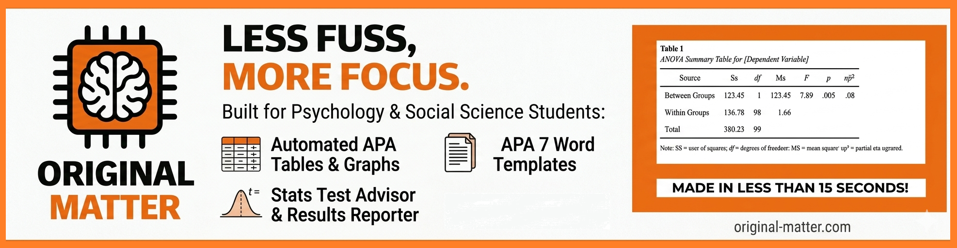
If you understand your data but still lose time second-guessing what belongs under the graph, that is exactly the sort of friction the Original Matter APA Formatting Pack is built to reduce. The pack includes the APA Graph Maker, alongside the APA Style Table Builder, Results Reporter, and Word Template Pack, and it is aimed at psychology and social science students who want cleaner graphs, tables, and results presentation without spending half the assignment fighting low-level formatting nonsense.
Because the point of the graph is meant to be the data. Not the part where you spend twenty minutes wondering whether SD belongs in the note, the legend, or the afterlife.