APA Graph Format: How to Format Graphs and Charts in APA 7
Graphs have a special way of making otherwise competent students feel as though they have accidentally wandered into graphic design. The data is usually fine. The problem is the moment you try to present it properly and discover that formatting a graph in APA style involves just enough rules to become irritating.
The good news is that APA graph format is not especially mysterious once you stop treating graphs as a separate species. In APA 7, graphs and charts are usually handled as figures. That is the key shift. You are not learning some strange side system for bar charts and line graphs. You are learning how APA wants figures to work, then applying that logic to graphs. Any visual display that is not a table counts as a figure, which includes graphs and charts.
What counts as a graph in APA 7?
In everyday student language, people talk about graphs, charts, plots, and figures as though they are all separate formatting universes. In APA, the line is much simpler. If the information is laid out in rows and columns, it is a table. If it is presented visually as a graph, chart, plot, image, or similar display, it is a figure. That means bar charts, line graphs, scatterplots, and similar visuals sit under figure rules rather than table rules.
That point alone clears up a surprising amount of confusion. A lot of students go looking for “APA graph rules” as though graphs live in their own little republic. They do not. They are figures.
When should you use a graph instead of a table?
Use a graph when the reader needs to see the pattern more than they need to inspect the exact numbers. A good graph makes trends, contrasts, and changes across categories or time easier to grasp quickly. A table is better when the exact values themselves are the point.
So if you want to show that one condition consistently produced higher scores than another, a graph is usually the cleaner choice. If you need the reader to see the precise values for every category, a table is often the better tool. APA’s broader guidance on tables and figures is built around that same practical split: use them to present a large amount of information efficiently and make the material easier to understand.
This is also where students sometimes make life harder for themselves. They build a graph for data that would work better as a table, then spend twenty minutes polishing an image that was never helping in the first place.
How to format an APA graph
A properly formatted APA graph is usually built from a few simple parts.
First comes the figure number. This appears above the figure in bold and should be numbered in the order the figures are mentioned in the paper.
On the next line comes the title, in italics and title case.
Then comes the graph itself, with labels clear enough that the reader can understand what they are looking at without needing to reverse-engineer your intentions.
If the graph needs extra explanation, source information, or clarification of abbreviations, that information belongs in a note below the figure. APA also expects axes and other figure elements to be clearly labelled.
In practice, that means something like this:
Figure 1
Mean Stress Scores by Condition
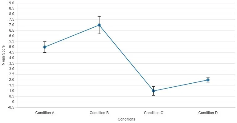
Note. Error bars represent standard errors.
That is the basic skeleton. Once you know it, most APA graph formatting stops being dramatic and becomes mainly a matter of not forgetting the small pieces.
What an APA graph should include
An APA graph should be readable before it tries to be impressive. The labels should be clear, the axes should make sense, and the legend should only be there if it is actually helping. If the visual needs colour, APA allows colour in figures, but it still has to remain accessible and interpretable rather than becoming a decorative cry for help.
For most student work, that means the graph should include:
a figure number
a concise italicised title
clearly labelled axes
a readable legend when more than one data series appears
a note below the figure when the reader needs extra context
You do not need to turn the figure into a miniature poster. In fact, the more a graph starts looking as though it wants its own exhibition wall, the more likely it is that something has gone wrong.
Bar charts, line graphs, and the usual student suspects
Most student APA graphs end up being bar charts or line graphs. That is fine. They are common because they are useful.
A bar chart usually works well when you are comparing categories. Different conditions, groups, or response types all sit quite comfortably in a bar chart, especially when the point is contrast.
A line graph usually works better when you are showing change or progression across something ordered, such as time, session number, or trial block.
The main thing is to match the graph to the logic of the data. Do not use a line graph just because it looks more serious. A line implies continuity. If your x-axis is a set of separate categories with no natural progression, a bar chart is usually the cleaner choice. APA’s sample guidance treats these common graphs as ordinary figure types rather than strange special cases, which is exactly how students should think about them.
Common APA graph mistakes
The most common mistake is forgetting that the graph is a figure and therefore needs figure formatting. Students often paste the image in, admire it for a moment, and then fail to give it the number, title, or note structure it needs.
Another common mistake is building a graph that is not self-explanatory. Axes go unlabeled. Legends are vague. Abbreviations appear without explanation. At that point, the graph may still look statistical, but it is no longer especially helpful.
Then there is the problem of using a graph when a table was the better choice, or producing a graph that tries too hard to be visually dramatic. APA figure guidance is not there to make the figure beautiful in some abstract sense. It is there to make it clear and interpretable.
And finally, there is the classic formatting stumble: students title the graph inside the image itself, forget the figure number, or leave out the note explaining what the error bars represent. This is usually not a deep failure of understanding. It is mostly the academic version of forgetting your keys.
A quick APA graph example
Imagine you are reporting mean memory scores for three study conditions: control, revision sheet, and retrieval practice.
Your graph might appear like this:
Figure 2
Mean Memory Scores by Study Condition
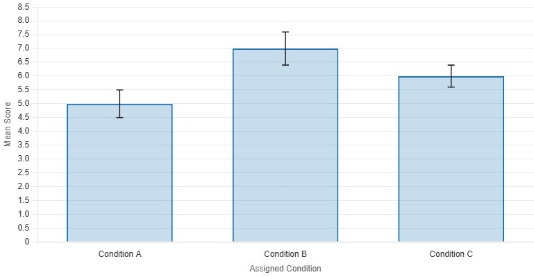
Note. Error bars represent 95% confidence intervals.
That is enough. The figure number tells the reader where this sits in the paper. The title tells them what the graph shows. The graph displays the pattern. The note explains the error bars. Nothing fancy. Nothing theatrical. Just clear.
Where students get stuck in real life
Most students do not actually get stuck on the idea of a graph. They get stuck in the stretch between “I have the data” and “this now looks like something I can submit without embarrassment.”
That is where formatting becomes unexpectedly annoying. Titles need cleaning. Axes need naming. Figure captions need writing. The graph has to look like APA, not like whatever Excel felt like doing that afternoon. This is also why graph tools can be genuinely useful when they are built with the format in mind rather than just throwing colours at a canvas and hoping confidence will do the rest.
Stop Letting Graph Formatting Become Its Own Assignment
If your results are clear but your graph still looks like it was assembled during a mild formatting emergency, that is exactly the sort of problem the Original MatterAPA Graph Maker is built to deal with, available in our Formatting Pack.
The preview version already gives students a proper feel for the workflow. They can test a grouped bar graph or line graph template, generate the figure, copy the caption, and download a watermarked sample export. The full version then unlocks custom graph editing, dataset controls, and clean exports without the preview watermark. In other words, it handles the tedious part without pretending the tedious part does not exist.
Because the point of the assignment is usually the data. Not the part where you spend half an hour trying to make your graph look less as though it escaped from default settings.
APA Graph Maker
Try a small set of APA-style graph templates before unlocking the full editor. In this preview, templates are fixed, custom fields are locked, and exported images include a watermark.
1. Choose a preview template
This version keeps the working example visible while greying out the custom editing tools.
Custom editing is locked in this preview. You can switch templates, then generate and download a watermarked sample export.
The full version unlocks custom graph types, editable titles, category labels, datasets, colours, and flexible data entry.
2. Graph preview and export
Generate the example figure, copy the note, or download a watermarked PNG or JPEG sample.
Preview exports include a watermark. The unlocked version gives you editable inputs and clean final outputs.
References
American Psychological Association. (n.d.). Figure setup. APA Style.
American Psychological Association. (n.d.). Sample figures. APA Style.
American Psychological Association. (n.d.). Tables and figures. APA Style.
American Psychological Association. (2021). Publication manual formatting checklist. APA Style.
American Psychological Association. (n.d.). Line spacing. APA Style.
American Psychological Association. (n.d.). Accessible use of color in figures. APA Style.
Purdue Online Writing Lab. (n.d.). APA tables and figures.
Scribbr. (2020). APA format for tables and figures: Annotated examples.